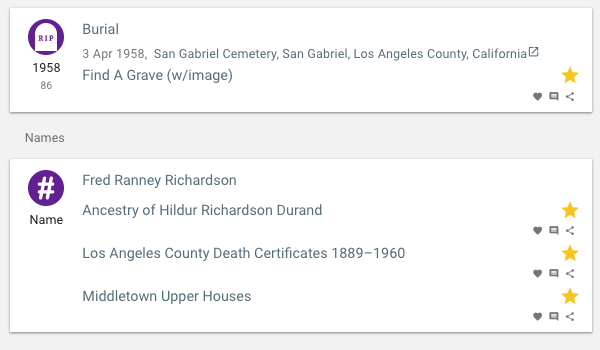
How about a simple CSS tweak to distinguish the Event label from the Source(s) beneath it? Look at the Names box: there’s nothing that immediately distinguish the Name itself visually from the sources attributed to that name. Yes, the sources have the little icons to the right of them and the Name doesn’t, but the text itself is identically styled. It’s a little less confusing in an event with a date and/or location (e.g. the Burial event in the screenshot), which intercedes between the event label and the first source. Still, to me, it’d all be clearer if the event label was distinctively different. The adjustment could be as simple as putting the event label/name in bold. Or underlining it. Or any number of other tweaks, whatever looks best.
Or maybe others don’t agree with my opinion about this? Anyway, just a suggestion.