The color box for a match is weird if you have the selected match active in the search box at the same time you use the left eyeball to call the filter popup 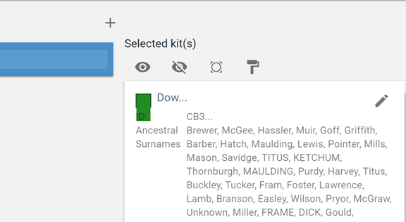
That’s odd. I can’t make the box overflow like that on my machine, but I just added something so that it shouldn’t overflow anymore. The new version should be “live” about 10 minutes from now. If you already have a rootsfinder tab open, please refresh it to get the latest version. If it’s still overflowing, would you please let me know?